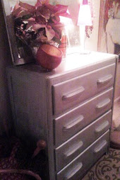
"she changed my life with a new lamp and a can of paint!" s. mcdaniels, louisville, ky

4.27.2010

What’s Your Decorating Personality? | Real Simple

What’s Your Decorating Personality? Real Simple

4.22.2010

space saver and showcase: shoe art! one of my finest moments......

most new york women live in very, very tiny apartments they are never home and they invest all their money on accessories, clothing and work gadgets. but there comes a time in glam gal's life when her space becomes more than a crash pad.  what to do? my client had no room for more "stuff" - literally every square inch was covered with 15 years worth of clothing and shoes. i couldn't even see her beautiful hard wood floors.
solution: after a quick look around the apartment, it was immediately clear that this woman already had her own FAB signature style and she didn't even know know it! she was surrounded with loads of beauty  and art: her shoes and bags! thus, and in order to clean up her space, we designed a wall of her accessories/ART. we bought modestly priced shelving (at ikea) that would run the length of her wall and blend with the existing paint (so as not to take up more space visually). in minutes we had the wall loaded with gorgous art and more space to walk through the bedroom.  was it a success? see for yourself!

4.17.2010

how to hang paintings and pictures

•hang pictures so the center is at adult eye level. somewhere between 5-6 feet or 58" - 62" from the floor.

•cluster three to four smaller pictures together instead of spreading them out across the room to create a unit and more finished look (see photo for example).

•pictures in a dining room can be hung lower on the wall since they will be viewed while seated.


•when creating a picture grouping, usually place the heaviest picture at the bottom (note: heavy can mean color and/or weight).


•cut out newspaper templates and tape them to the wall to help determine the best placement.


•vertical artwork creates a more formal setting; horizontal artwork creates a casual and restful setting.


4.10.2010

room design worksheet for your next interior design project!


this blog is dedicated to helping people create their ideal homes in the least expensive and quickest way. therefore, i have below created a worksheet for our projects. this sheet give you direction and concrete solutions to the decorating questions of each project.


feel free to steal/"borrow" it from me!

DESIGN WORK SHEET OUTLINE


TIMELINE

Ideal start date:_____________________PRACTICAL NEEDS AND DETAILS
Ideal completion date:________________

WHAT IS THE ULTIMATE GOAL FOR THIS PROJECT: _________________________________________________________

WISH LIST:
_________________________________________________________
WHO USES THE ROOM?
Family ___________________________________________________
Children __________________________________________________
Pets ______________________________________________________

ACTIVITIES
reading _______________
hobbies_________________
________________________
computer - desktop
computer - wireless
TV viewing/importance (1-10)? ______


ENTERTAINING
business large groups
social informal
small groups casual
number of chairs NEEDED:________

DAILY USE
daytime
nighttime
equally

What is your biggest concern at start?
_____________________________________________________
_____________________________________________________
______________________________________________________


What pieces will stay in the room?
___________________________________
___________________________________
___________________________________


What needs to be added to this room?
____________________________________
____________________________________
____________________________________


CEILING
normal_________ high_________ pitched________

DETAILS
Natural light? ________________________

Focal point?__________________________


STYLE PREFERENCES

List three adjectives that describe the feel
of your dream room.
___________________________________
___________________________________
___________________________________


STYLE
What style/s best appeals to you:
cozy traditional
lived-in contemporary
romantic west indies
formal eclectic
country casual elegance
elegant seaside cottage
transitional aspen lodge
casual urban loft
country french english
old world european


COLOR SCHEME
What color combinations appeal to you?

whites naturals/neutrals
grays and blacks earth tones
pastels warm colors
jewel tones nncool colors


What amount of color appeals to you?

loads of color
subtle color
color mostly in accents
color limited to walls and floors


What feel appeals to you?
rooms that appear spacious and open
rooms cozy, intimate & comfortable


What colors and wood tones appeal to you?


___________________________________


___________________________________


___________________________________


stripes
mini-patterns
plaids
geometrics
florals
leather
abstracts
tapestries
large patterns small patterns
bold, bright patterns
subtle patterns with texture

WINDOW TREATMENTS
Do you have existing window treatments?

If so, what are they?

top treatments
vertical blinds
full draperies
shutters
side panels
wood blinds
woven blinds

outside view /colors
__________________________________


fabric shades importance


(1-10) ______


DECISION MAKERS
____________________________________
___________________________________

BUDGET PLAN

up to $5,000
$5,000 to $10,000
$10,000 to $15,000
$15,000 to $20,000
$20,000 to $30,000

____________________________________


If completing in multiple phases, how much
for phase 1, 2...
_________________________
_________________________
__________________________


Floor type? ____________________________________


Adjoining room details? ___________________________

FABRICS THAT APPEAL (include item numbers)
________________________________________
________________________________________
________________________________________
________________________________________

PAINT
LIST PAINT COLORS WITH ITEM NUMBERS
______________________________________________
______________________________________________
_______________________________________________
___________________________________________________

4.01.2010

in honor of my mother....who would have loved that i am doing this blog and big life change...

as much as we may hate to admit it (especially as adults), mothers are pretty much right about everything, including (and especially in my case) home decor. i'm sure many of you have experienced the subtle eyebrow raise of disapproval when your mother saw your new rug. or as my mother would ask "is this a deliberate design decision?", which basically means she hates it. no matter what the gesture, consider this--she's probably right - your personal tastes have probably evolved from growing up around her decor and designs - so in essence, she will be the best expert by default and years of experience.

interior designer, donna hoffman shares with real simple famous phrases from mom and how you can apply them to your interior design strategy:

What design tips have I learned from my mother?

Slow And Steady Wins The Race. Don't feel like your home needs to come together in 1 fell swoop. It's better to finish one room completely than spritz budget dollars and energy in 10 different directions. All you'll end up with in a depleted budget and rooms all missing critical finishing touches. Remember: good things come to those who wait (did your mother say that one too?!)

You Get What You Pay For. Cheapest is not always the smartest way to go in home furnishings. Cheapest will always be the most cheaply made, cheaply designed, cheaply executed and cheaply built. You get the point. Buying the cheapest in design is often a case of "throwing good money after bad money".

But You Look Good In Florals. Yeah, well you might, but your sofa doesn't. What large scale florals do to your hips...imagine that on a 84" wide piece of stuffed furniture. It'll suck up more visual space in a room than you can imagine and you'll tire of it faster than you can say, "Does this sofa make me look fat?"

Don't Buy Suits. End tables and coffee tables need not be matchy-matchy. Beyond a dining room or bedroom, that "room in a bag" look most usually is a down market look. If you want a look that rivals something in a design magazine- let there be conversation between your case goods, not duplication.
*If you currently have the matchy-matchy thing happening, you can easily fix the problem. Start breaking up the marriage...of furniture that is. Separate matched pieces by relocating 1 'twin' into an alternate space.

Sit Like A Lady. Particularly, if you're wearing a skirt. Chairs are marvelous. Think of the chairs in a space as being little works of art- yes, think comfort, but also think shape, think pattern, show a little leg on some, demurely skirt some of the others, go bold and deep in some places, and ever so darling elsewhere. Sit like a lady. It'll feel great.

A Way To A Man's Heart Is Through His Stomach. Yes, so we all know. However, that doesn't mean that the Mr. of the house shouldn't have his appetite indulged when it comes to design. He may not want to help select every single piece of furnishing, however let his voice be heard regarding the overall theme, colors and style. In your personal offices, hobby rooms, etc- well, all bets are off. However the common areas of your home should be enjoyed by both. A way to a man's heart may be through his stomach- but there's a sensitive, artistic core in that fella too and as a normal human, he does indeed respond to environment and design.