"she changed my life with a new lamp and a can of paint!" s. mcdaniels, louisville, ky

4.02.2012

apartment therapy outdoor page launch!!!


just launched and i've already found fantastic stuff and prints!


I picked my two favorite illustrations to show you, and they all happen to be native to the U.S. First there's the Atamasco Lily by Julie Martinez. "At the edges of its historic range, it is at risk, although in some states it is quite common." Encouraging! Next, we have the gorgeous Stonogyne of Hawaii by Wendy Hollender. Sadly, it "easily falls into the IUCN Critically Endangered (CR) Red List category which designates it as facing the highest risk of extinction in the wild." Third, there's Glade Mallow by George Olsen, a tallgrass prairie plant. It may be on the plainer side (though I think it's lovely), but imagine it in all its 9-foot tall glory!
Luckily for those of us who didn't make it to this exhibit, the Losing Paradise? catalogue is available for purchase through the ASBA, and it has 44 full-color artwork reproductions from the show.

3.23.2012

hostess with the mostess's cutest shower ideas!


for more shower and party ideas visit hostess with the mostesss: http://www.hwtm.com/index.cfm?page=albums/view_album&albumid=78

3.20.2012

NPR on Creativity!


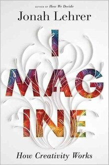
What makes people creative? What gives some of us the ability to create work that captivates the eyes, minds and hearts of others? Jonah Lehrer, a writer specializing in neuroscience, addresses that question in his new book, Imagine: How Creativity Works.
Lehrer defines creativity broadly, considering everything from the invention of masking tape to breakthroughs in mathematics; from memorable ad campaigns to Shakespearean tragedies. He finds that the conditions that favor creativity — our brains, our times, our buildings, our cities — are equally broad.
Lehrer joins NPR's Robert Siegel to talk about the creative process — where great ideas come from, how to foster them, and what to do when you inevitably get stuck.


How Creativity Works
Hardcover, 256 pages |Purchase Featured Books

Interview Highlights

On comparing Shakespeare with the inventor of masking tape
"I think we absolutely can lump them all together. I think one of the mistakes we've made in talking about creativity is we've assumed it's a single verb — that when people are creative they're just doing one particular kind of thinking. But looking at creativity from the perspective of the brain, we can see that creativity is actually a bundle of distinct mental processes.
"... Whether you're writing a Shakespearean tragedy, or trying to come up with a new graphic design or writing a piece of software, how we think about the problem should depend on the problem itself. Creativity is really a catch-all term for a variety of very different kinds of thinking."

On how Steve Jobs redesigned Pixar studios to maximize collaboration and creativity
"The original design for the Pixar studios consisted of three separate buildings, where they'd put the computer scientists in one building, and the animators in a second building and the third building would contain everybody else: the directors, the editors and so on. Steve realized that that was a terrible idea; that the real challenge of Pixar was getting people from these different cultures — these computer scientists and these cartoonists — to work together, to really collaborate. And so he insisted that Pixar studios just be one vast, cavernous space."

On forcing people to meet and mingle ... even if it's in the bathroom
"[Jobs] insisted there be only two bathrooms in the entire Pixar studios, and that these would be in the central space. And of course this is very inconvenient. No one wants to have to walk 15 minutes to go to the bathroom. And yet Steve insisted that this is the one place everyone has to go every day. And now you can talk to people at Pixar and they all have their 'bathroom story.' They all talk about the great conversation they had while washing their hands.
" ... He wanted there to be mixing. He knew that the human friction makes the sparks, and that when you're talking about a creative endeavor that requires people from different cultures to come together, you have to force them to mix; that our natural tendency is to stay isolated, to talk to people who are just like us, who speak our private languages, who understand our problems. But that's a big mistake. And so his design was to force people to come together even if it was just going to be in the bathroom."

Jonah Lehrer is a contributing editor at Wired magazine and the author of How We Decide and Proust Was a Neuroscientist.
Nina Subin/Courtesy Houghton Mifflin Harcourt
Jonah Lehrer is a contributing editor at Wired magazine and the author of How We Decide and Proust Was a Neuroscientist.

On why you should stop trying to harness your brain, and instead help your brain get out of its harness. Take a long walk. Daydream. Find some way to relax. Get those alpha waves. Alpha waves are a signal in the brain that's closely correlated with states of relaxation. And what scientists have found is that when people are relaxed, they're much more likely to have those big 'A ha!' moments, those moments of insight where these seemingly impossible problems get solved. So when you hit the wall, the best thing you can do is probably take a very long, warm shower. The answer will only arrive once you stop looking for it."

On the relationship between creativity and originality — and being triggered by other people's ideas
"The brain is just an endless knot of connections. And a creative thought is simply ... a network that's connecting itself in a new way. Sometimes it's triggered by a misreading of an old novel. Sometimes it's triggered by a random thought walking down the street, or bumping into someone in the bathroom of the studio. There are all sorts of ways seemingly old ideas can get reassembled in a new way."

On the creative processes that resulted in Nike's "Just Do It" campaign
"This is a great story from Dan Wieden at Wieden+Kennedy, the very honored Portland ad firm. ... He'd come up with seven videos for the new Nike ad campaign. ... He knew these different videos which featured different sports needed a shared slogan. But he just couldn't think of the slogan. ... At some point during the day, somebody must've mentioned Norman Mailer to him. And so Norman Mailer was in the back of his head somewhere.
"It's near midnight. His deadline's approaching. He's really, really frustrated at this point because he can't come up with this damn slogan. And then suddenly he thinks of Norman Mailer. He remembers Norman Mailer wrote this book called The Executioner's Song about Gary Gilmore. And he remembers Gary Gilmore's last words right before he's executed by a firing squad in Utah. His last words were, 'Let's do it.'
"And Dan Wieden thinks to himself, Geez, that's pretty brave. That's a pretty brave sentiment to have right before you die — to just get it over with. But he realizes 'Let's Do It' isn't quite right, so he tweaks one word. And there you get 'Just Do It.' ... But that's a perfect example of how, in a sense, that's an old idea. It was a line in a Norman Mailer book, and he tweaked it ever so slightly. He substituted one word and came up with one of the most influential advertising slogans of the second half of the 20th century."

"The question becomes, what happens if you hit the wall? Because we've all got experience with this. You're working on a creative problem, and then all of a sudden that feeling of progress disappears ...

Buy the book - read more: NPR.com

3.11.2012

10 questions with answers to make your house into a home (from real simple)


1.  Do I wake up in the morning feeling truly rested? While there are a whole bunch of reasons I might toss and turn at night, a clean and serene bedroom certainly helps me feel at ease. If you've been sleeping fitfully, perhaps it's time for some new bedding. Updating your bed with a down or Tempurpedic mattress topper, some new pillows (I'm loving Ikea's Gosa Pinja pillows for side sleepers) and new bedding (try cozy flannel for winter, smooth cool sateen for summer) can make a big difference in your sleep patterns.


2.  Can I play music in my home, including in the bedroom and the bath? Sound, like scent, is one of those elusive layers in a home that you don't recognize as important until there's something annoying, like loud neighbors or a blaring car alarm, to jolt you. Even if you're a rock or hard core fanatic, don't limit your in-home soundtrack. Opera on Sunday mornings, soul for cleaning, power ballads while showering.


3.  Do I have a comfortable spot in my home where I can read, talk on the phone, even nap, that is not my bed? If the most comfortable spot in your home is your bed, it's time to rethink things. A comfy chair in the corner of the bedroom, extra pillows on the couch, a floor cushion by a sunny window, an ottoman pulled up to the sofa, a throw near a drafty window, angling a daybed to catch the afternoon light, are all ways to make a spot more inviting.


4. Can I walk around my house barefoot? While we're not advocating a shoes off policy (though your home may stay cleaner if you do), the rugs should feel nice on the feet, the floors clean and smooth. It seems like a chore but I do a super fast damp mop on my wooden floors every morning (really superfast. And yes, sometimes I even make airplane noises!) with a old rag tucked into a Swiffer mop and spritzed with a little Mrs. Myers Lavender all-purpose spray.


5. Does my home smell good? That little mopping habit not only keeps my floors clean, it also keeps my home smelling nice. Cleansers, a scented candle, opening the windows, cooking -- these all bring a layer of scent into your home.

 
6. Is there a convenient spot for a guest to put down a coat or hang a bag? How about one for yourself? If you don't already have one, consider establishing a landing strip in your home near your front door. This alone can do a lot towards alleviating a clutter takeover in your home.


7. How about a spot that I feel comfortable entertaining a guest? Maybe you spend a lot of time in your home alone, maybe you hate having anyone over, but when you do, step back and take a look at how comfortable someone is. Where do they choose to sit? You can learn a lot about your home from a visitor. You don't need a formal living room, just two chairs with someplace to put down a glass of water.


8. Can I vary the mood in my home with lighting to serve that room's functions? There should be reading lights within easy reach of the bed or sofa, enough light in the kitchen to chop by or peer into the back of your pantry. If you're always squinting, time to consider a well-place lamp or at least the wattage of your lightbulbs. Before you make any major changes in your home, invest in some lighting. That may be all the work you need.


9. How organized is my home? Is your clothing closet well-organized enough that you can get dressed in 15 minutes? Do you have the makings of quick meal to feed an unexpected guest? What about your bathroom? Are all the things you need easily accessible or do you have so many things to take out and put away in the morning that you create a tornado that you then dread putting away?


10. And, perhaps most importantly, do I feel happy walking into your home? Are you proud of your home? Your home should make you smile to be there.


3.10.2012

Orange you glad you checked my blog today?

All about Orange my friends!


For more fun images: http://www.stylelist.com/2012/02/03/design-inspiration-paint-ideas_n_1253752.html#s651476&title=Paint_Your_Walls

3.09.2012

A Modern Mad Hatter Table from Hostess with the Mostess


TELL ME THIS TABLE DOES NOT ROCK!??
AND GUESS WHAT?? ALL THE DETAILS ARE BELOW FOR YOU TO STEAL..EHMM BORROW - THANKS HOSTESS!


CREATIVE DETAILS…


Here’s a run down of the design concepts & elements for this table:.
Linens & Chairs:

I wanted this table to be very fun & glam, so the a sequined black New York linen from La Tavola made for the perfect foundation! Bright Dupionique Iridescence napkins and chair cushions added the perfect pop of bright color and really stood out against the black. Gold chiavari chairs were adorned with the cutest black & white paper clocks, which I found at Windrosie on etsy..
Place Settings:


Tea cups and saucers served as the focal point of the place settings. Simple, modern white cups & saucers from crate and barrel were dressed up with custom “Drink Me {Please.}” labels on the cups {free download coming soon}, which were attached with Mini Glue Dots for easy removal after the party..

 
The saucers were embellished with a small gold foil dessert doily in the center and acrylic beads all the way around the edge. The beads were cut from a strand of an inexpensive acrylic beaded curtain I had leftover from another party. 1 strand goes a LONG ways and you can still use the rest of the curtain as a party backdrop or to dress up other elements of the party. Acrylic gold charger plates (about $2.50 each) added a touch of glam..


The wine glasses {from HomeGoods} were adorned with decorative keys and key holes that are actually scrapbooking embellishments found at Michaels. Extra keys & key holes were also sprinkled around the table. They started off a darker copper color so I spray painted them bright gold first to better match the design..


Floral Centerpiece:

Did Heavenly Blooms do an amazing job with this floral centerpiece or what?! I was overjoyed when she arrived with these (a smaller version was used on the dessert table) – they were EXACTLY what I had envisioned! The elevated horizontal design was inspired by this centerpiece from this table that Canvas and Canopy styled a while back. It was one of the first things I thought of when designing this table because the unique style is so striking and whimsical – just like a modern Mad Hatter tea party should be! I added was some faux butterflies to the vase to help tie it into the place settings..


Table Embellishments:

The middle of the table around the base of the centerpiece was decorated with bright green moss, flower balls, tea cups/saucers, and a tea pot. I found the tea pot at Shinoda Design Center for only $4. It started out basic white, so some red spray paint, faux diamond ribbon, and paper labels were called for in order to give it a “modern Mad Hatter makeover”. A coat of clear ceramic craft glaze was added after the spray paint to give it a super shiny, high-gloss look..

 
A few of the saucers were also spray painted red, orange, and pink, then, glazed, and embellished with more custom paper decals {free download coming soon}. I only painted the inexpensive cups/saucers found at HomeGoods… the white ones from Crate & Barrel were just decorated with paper skeleton keys (attached with Mini Glue Dots) and the 2 red/white cups with the bold graphic pattern are actually rice bowls found at C&B too. =).


How Glue Dots were used:


– to attach the paper labels to the tea cups


– to attach the acrylic beads to the saucers


– to attach the butterflies to the centerpiece pedestal and the plates


– to attach the decorative key holes and keys to the wine glasses

3.03.2012

Luscious Lacquered Wall - Apartment Therapy


Luscious Lacquered Walls
Apartment Therapy

http://www.apartmenttherapy.com/

Lacquer is the ultimate glamorous finish for a wall. It is an expensive and often impractical treatment to do, as it shows any imperfections in sheetrock and plaster. But when it's done right, boy is it gorgeous!

2.29.2012

silly sculptures? gigantic globes? how to deal with your super fun, super strange stuff!


Love that huge silly globe? Is that fabulously awful foot sculpture not getting proper attention? Here are some tips to make even the most unusual objects fit seamlessly into your home!

1. An oversize object too big for a shelf or or a side table? Try the floor; especially if the item is playful. Framed by curtains a super large globe or sculpture looks as if it's on stage. These items can bring kick to a corner and possibly hide a radiator or other unappealing objects.

2. And large bed in a small space? Rule of thumb: the top of a bed frame should be at least six inches from the ceiling. If the frame is open and airy, the space won't feel claustrophobic. White walls can highlight the lines of the bed to a crisp effect. Dark paint or wallpaper will add impact if you incorporate some of the color from the bed onto the walls.

3. A stately/huge chair? Play up the drama of a striking seat by making it the first thing you see in the room. Give it an equally grand companion, such as a large lamp or side table, to help it make sense among simpler pieces. Use the same color palette as your existing furniture and the larger object will feel right at home.

4. Quirky statue? Use something less form than a bust and funnier than a horse head such as an anatomy sculpture. Place it in a conspicuous spot, like on a side table or by the entryway as a door stop. The item will elicit question and smiles!

5. A graphic rug? A bold pattern on the floor gives a focal point to a room with a mix of furniture styles - it's unifier. To ease into the look, start with a neutral sisal, top it with a subtle strip, then put the showiest rug on top. Worried about the pattern overload? A solid (rather than glass) coffee tale with mitigate the effect.

6. A cool sculptural table lamp? You don't need to use a task lamp for it's intended purpose. If you have a stunner, you can use it as ambient lighting by putting it on a side table in a corner. Switched on and placed in front of fabulous window treatments or painted walls, it will cast a special glow.

7. Modern chandelier? A contemporary light can jibe with a classic piece if the finishes match. Set against a traditional mirror it can give you twice the impact and light. Or set over a transitional table with similarly shaped objects as centerpieces to echo the overhead shapes and features.

8. An open table? Use the space inside for an unexpected display. Place a light with in the cage of the open table. Or use a cool scuplture piece to give an unexpected "birdhouse effect" to the object inside.

2.21.2012

garden and gun - (my hot, new favorite "design" mag) featuring: lone star retreat


As you wind down the sleepy back roads of Round Top, Texas, toward the Prairie by Rachel Ashwell, the Union Jack flying third on the flagpole (beneath the Stars and Stripes and the official state flag of Texas) is the only sign that the proprietor of this sprawling bed-and-breakfast might not be from around here. Though British by birth, Ashwell—author, designer, and founder of the global Shabby Chic brand—has spent the past year transforming five primitive buildings on forty-six acres of rolling farmland into an authentic Lone Star retreat, where guests mingle easily with visiting locals and the property’s familial staff. There are cattle grazing, roses blossoming, and panoramic views for miles in all directions. It’s part Out of Africa, part Lonesome Dove—a secluded, peaceful oasis at the heart of an eclectic and emerging travel destination.


Ashwell discovered Round Top, known for its quarterly antiques fairs, years ago during a foraging trip and fell in love with the tiny community’s bohemian spirit and laid-back lifestyle. “The flea market shows are by far the best I’ve ever been to,” she says, referring to the weeks each season when antiques dealers and treasure hunters inflate the local population from less than a hundred year-round residents to about thirty thousand people. (The upcoming spring antiques shows run from March 23 through April 8.) So when the property formerly known as the Outpost at Cedar Creek Inn came up for sale at the end of 2010, Ashwell, a longtime loyal guest, couldn’t resist making an offer. Three months, some Farrow & Ball paint and wallpaper, and a lot of hard work by Danny Riebeling (the property’s foreman, cook, and do-it-all guy) later, the Prairie officially opened its doors.


To create lived-in spaces to complement the five original farm buildings, some of which date back to the 1800s, Ashwell focused restoration efforts on the structures’ unique building styles and histories. She installed crystal chandeliers that would make Marie Antoinette swoon but left original wooden floorboards unvarnished and tin roofing largely intact. To make use of taxidermy left behind by the inn’s former owner, she crowned the mounts with vintage floral hats for just the right amount of whimsy. Perhaps smartest of all is the way she weaves local memorabilia (a Texas-shaped mirror, for instance, and vintage neon signs) into the decor with a wink and a nod. After all, many of her prize purchases over the years have come from the area—only back then, it was her little secret.

The entire article and more photos at:


2.17.2012

I've been seeing this all over the place - thanks O'Happy Day for the direction!!  (see Martha Stewart's website for how to make without the lantern base). 

Only comment - to really make this work you need LOADS of balls in the air (pardon the pun) to almost completely cover the ceiling. Take the time - it's the finished product is totally worth it. I actually had some on these in my bedroom in NYC above my bed - they were ivory and pink and to me they were symbols to encourage creative ideas while I slept!

2.14.2012

Sweet “Eloise at the Plaza” Birthday Party: Hostess with the Mostess


Sweet “Eloise at the Plaza” Birthday Party

PARTY DETAILS, as told by Charynn

:
“My daughter Madelyn has loved Eloise since she was 2 years old. She collects the dolls, books, and has ALWAYS asked for a party at The Plaza. Since it is such a special ‘number’ birthday – for her 5th birthday, I decided to style a pink, black, and white Eloise themed soiree. I enlisted the help of Kelly from WH Hostess to create an amazing invitation and coordinating party goods using Madelyn (and Eloise)’s favorite color, pink, and my love for black and white patterns. For the invitation, we had Vana Chupp of Le Papier Studio a custom silhouette of Madelyn created in an Eloise ‘pose’ that we carried through in several of the other party goods.

When Madelyn suggested the idea of an Eloise party, I immediately thought of an all-pink bakery that Eloise might visit on one of her trips outside of The Plaza. We built large risers to mimic the interior of a bakery store window, and created an awning using black and white striped fabric from Ikea. I used white cake stands and dessert ware from my collection, and I also greatly expanded my collection with a fabulous (and super inexpensive) project: DIY milk glass using glassware from Goodwill and white spray paint. It was styled with all pink desserts that were created by myself, with touches of black and white throughout.

Some of Madelyn’s favorite desserts were on the display, including: pink chocolate coated Oreo truffles, hot pink macarons filled with dark chocolate ganache, chocolate cupcakes with pink strawberry buttercream, NYC black and white cookies, mini donuts sprinkled with pink coconut, chocolate dipped pretzels, meringue ‘ice cream cones’ that rested on WH Hostess patterned paper to match that theme (and on a DIY ice cream cone stand!), pink gum balls and hard candy from Candy Warehouse, and absolutely adorable marshmallow pops made especially for Madelyn by The Marshmallow Studio. One of Madelyn’s special requests for the pink ‘bakery’: two different cakes: a pink rosette cake, and a fondant covered creation with pink stripes and a replication of her silhouette in fondant.

Another of Madelyn’s requests was to have a tea table set up for her and her friends to use at the party. As a surprise, I ordered an actual Eloise tea set from The Plaza to decorate the table, along with some pink and black cupcakes topped with pink and white swirled lollipops, strawberry cream cheese tea sandwiches, Eloise-themed stuffed animals, and pink and white polka dot suitcases. I made curtains using more of the Ikea fabric, and to tie the theme together, styled the floor with a black and white chevron rug. The tea table was so simple to pull together, and it was Madelyn’s favorite part of the party!

For the favor table, I really wanted to make it fun, whimsical, but also fitting for the preppy and modern theme. I made the ‘FIVE’ letters using wooden letters and small rectangular wooden plaques painted white and filled a bookshelf with the favors and lots of pink balloons. For favors, the kids at the party received a marshmallow pop from The Marshmallow Studio, ridiculously cute pink Eloise headbands made especially for the party by EmzBowz, and a custom memory card game featuring WH Hostess graphics custom-made for the party. The display was topped off with a banner from WH Hostess and striped fabric. One of MY favorite parts of the party were the little signs that Kelly and I came up with, using little phrases and key words from the books, including ‘Gifts from ME, Madelyn’ for the favor table and ‘oooooohhh, I absolutely love BIRTHDAYS!’ for the tea table. It was the perfect addition to the party to add a touch of the character feeling without going overboard.

The most talked about (and loved by the adults) part of the party was the inventive drink station we created. I have always found it amusing that, in the books, Eloise knew to order Nanny a drink from room service. Just like Nanny, the adults at our parties like a little ‘libation’ or two. I created a simple background for the table using a large silhouette from the stationery in an ornate frame from Ikea. Kelly created custom labels for the liquor bottles that were displayed on a cake stand for some height, and mixers were displayed in simple glass carafes. Another creative sign let all of the guests know that these were ‘Nanny’s Libations’ and were not for kids. A small game was also created using hot pink sixlets, as the guests had fun guessing how many ‘champagne bubbles’ were in the jar.

With a lot of pink and some key character touches for my little Eloise, and some modern patterns for my taste, I was able to create an adorable party that my daughter will remember for years to come. All of the hard work paid off when my daughter announced after the party that ‘Mommy brought The Plaza to my house!’”

*****VENDOR CREDITS & RESOURCES:


– Party Stationery: WH Hostess
– Event Styling: Two Sugar Babies and WH Hostess / The Party Dress
– Desserts: Two Sugar Babies
– Gumballs & Candy: Candy Warehouse
– Marshmallow Pops: The Marshmallow Studio
– Pink Headbands: EmzBowz
– Tea Table and Picture Frames: Ikea
– Fabric: Ikea, JoAnn Fabric
– Wooden Letters and Plaques: JoAnn Fabric
– Pink Suitcases and Paper Straws: Shop Sweet Lulu
– Pink Cupcake Wrappers and Swirl Lollipops: Target